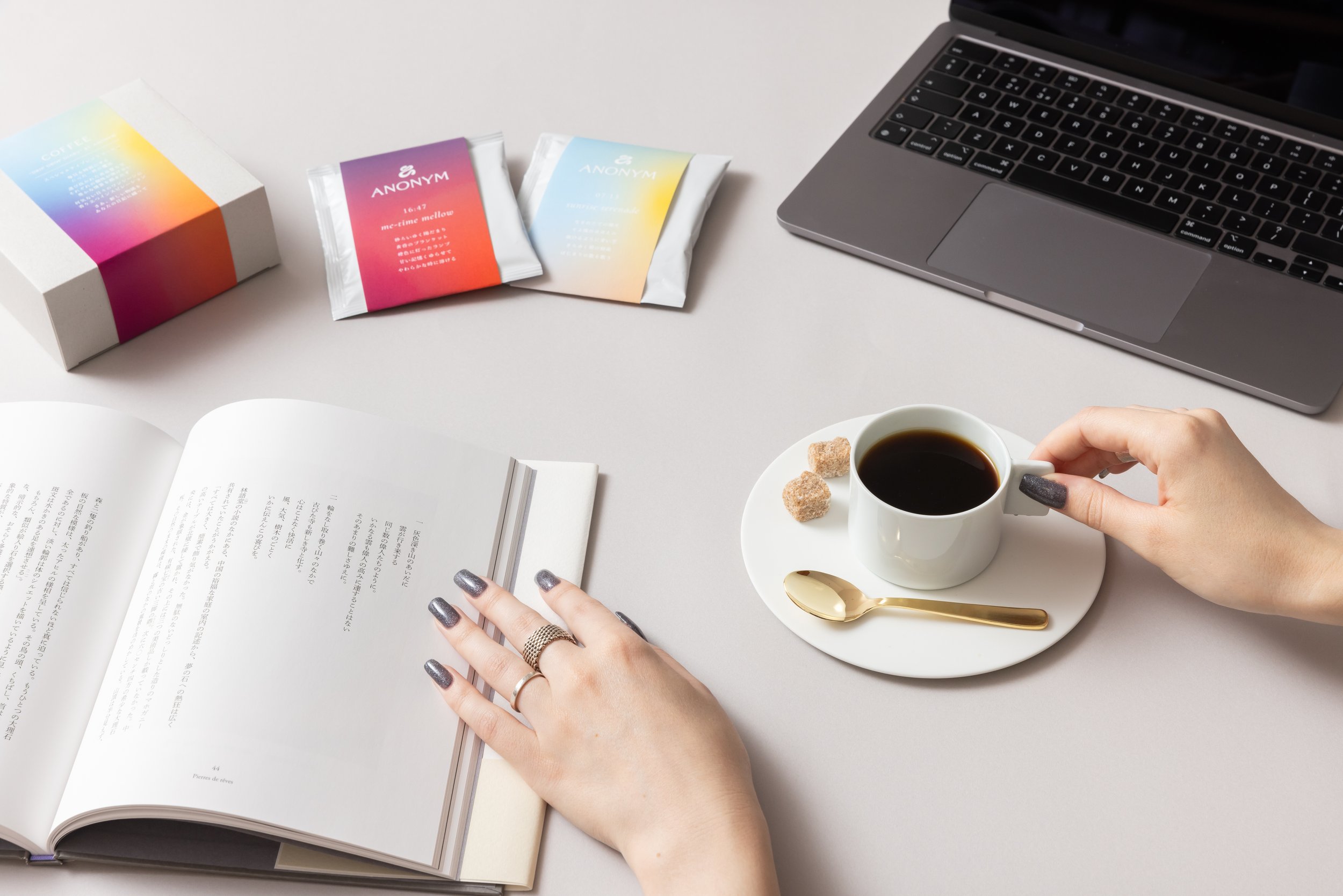
Created as a sub-project under ANONYM, Drip Drop Diary was developed around the idea of coffee as a small private ritual. Rooted in the founder’s love of both writing and coffee, the project brings together reading, taste, and everyday reflection in a format designed to make ordinary moments feel a little more special.
SERVICES
Branding, packaging, art direction
-
The concept was shaped by the idea of “a magical cup to make every day special”. Rather than positioning coffee as a simple daily product, the project treats each cup as a small story: quiet, sensory, and personal. The name Drip Drop Diary draws on both the sound of coffee drops falling into the cup and the notion of a diary, where each moment holds its own mood, memory, or fragment of narrative.
-
The visual identity was designed to feel warm, expressive, and gently intimate. For the parent brand ANONYM, the logo takes the form of a monogram built around the letter A, drawn with a freehand quality that recalls the movement of a brushstroke. That gesture gives the identity a more human and open character, avoiding a polished feel in favor of something more personal and alive.
-
The product was developed as a specialty coffee format designed to attach directly to a cup, allowing hot water to be poured straight through. That ritual of preparation became central to the project’s character, reinforcing the sensory rhythm suggested by the name itself. The packaging direction was developed to express warmth, richness, and the quiet pleasure of making space for a good coffee and a good page.