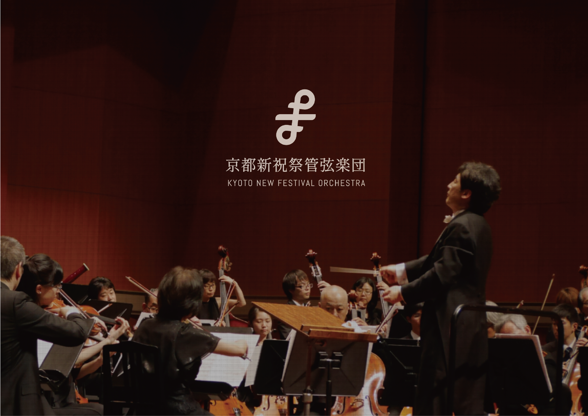
Kyoto New Festival Orchestra commissioned a new logo for its 10th anniversary, with the aim of expressing an identity that feels inclusive, expressive, and deeply connected to Kyoto. The project was developed around the idea of music as something shared and continuous — a force that brings different people, energies, and traditions together through sound.
SERVICES
Logo, visual identity
-
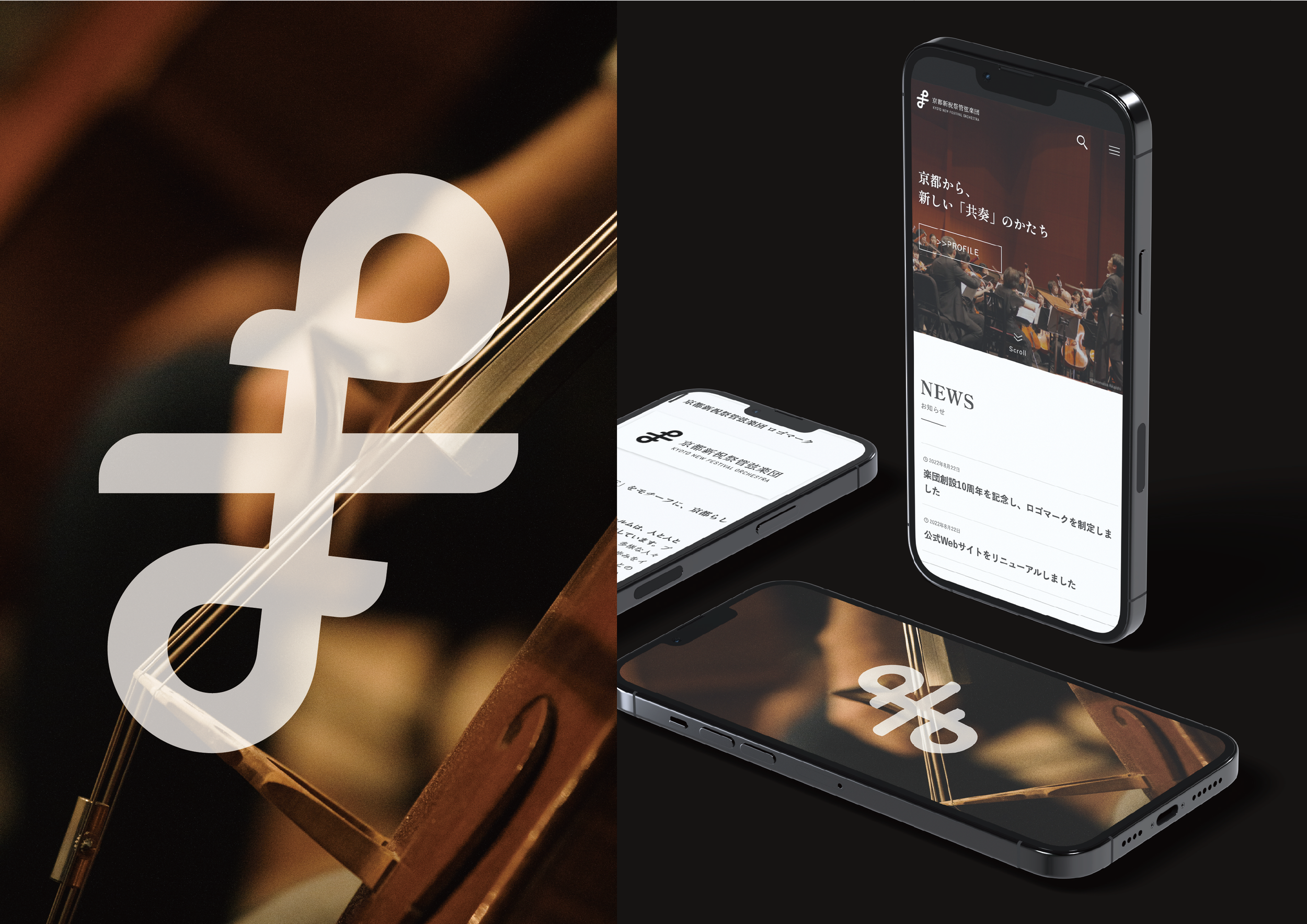
The identity was shaped by the idea of harmony as both movement and connection. Rather than treating music as something fixed, the direction sought to evoke its living quality: notes that overlap, respond, and blend into one another as they fill the atmosphere. The result is a mark that feels fluid and dynamic, while still carrying a clear sense of structure.
-
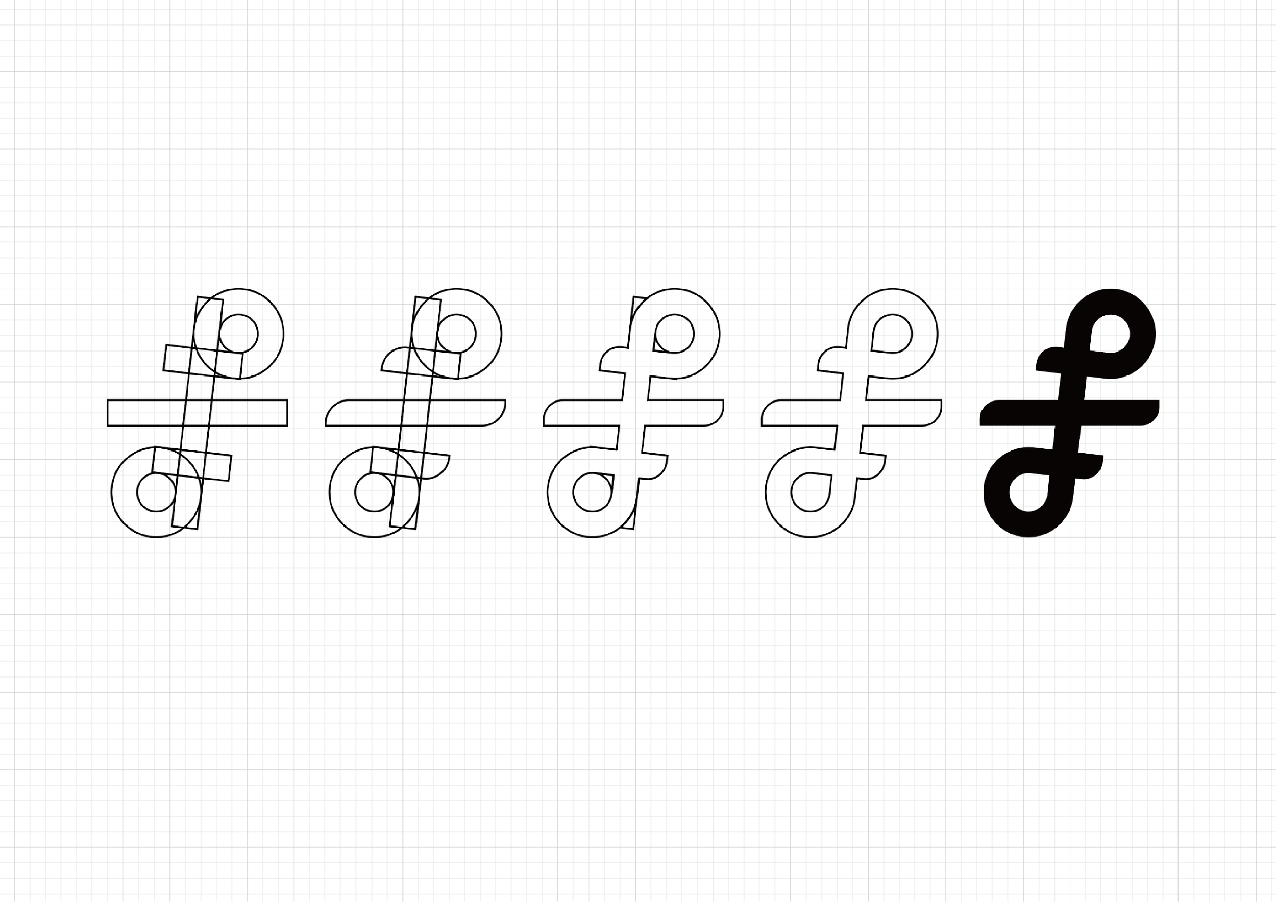
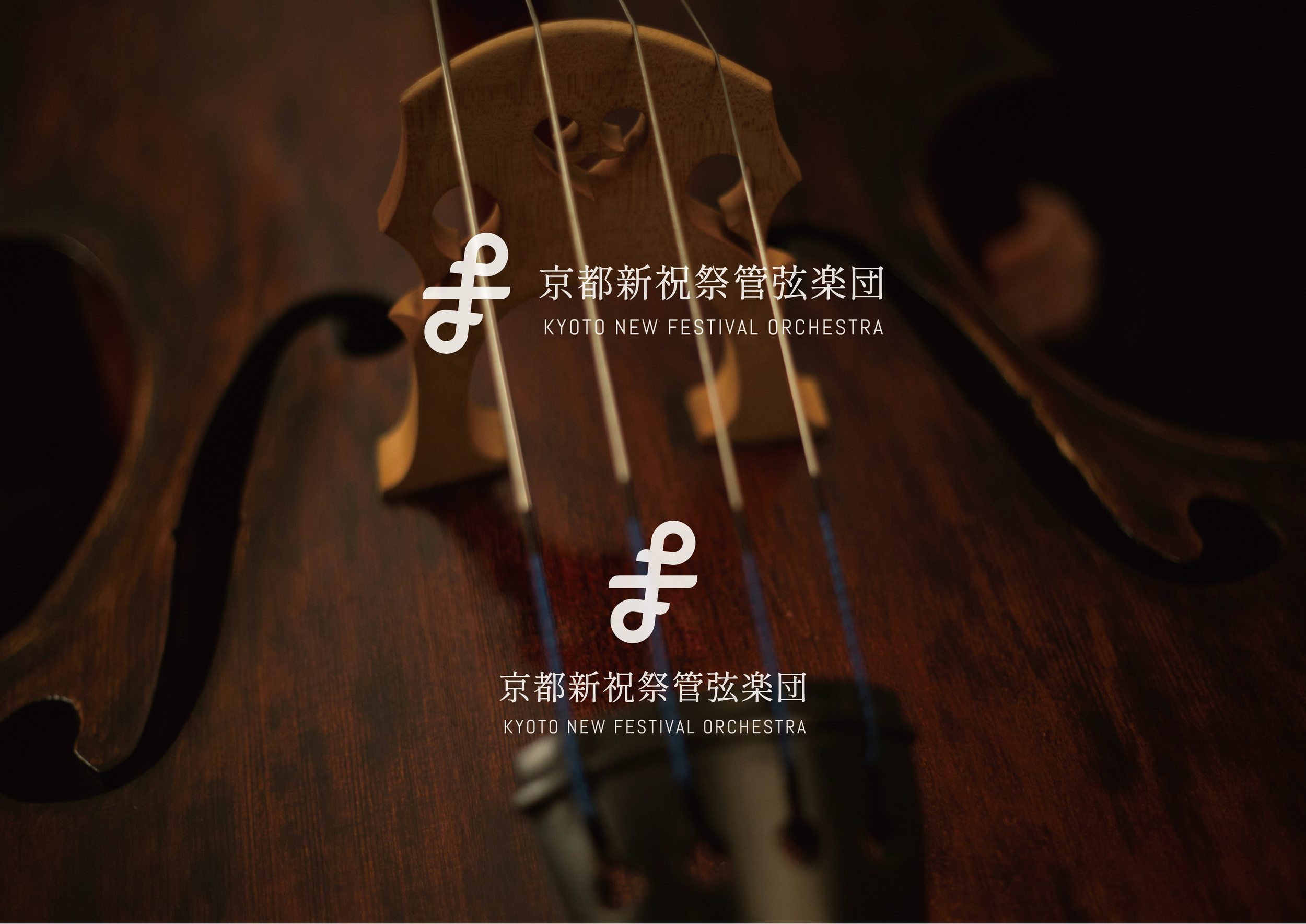
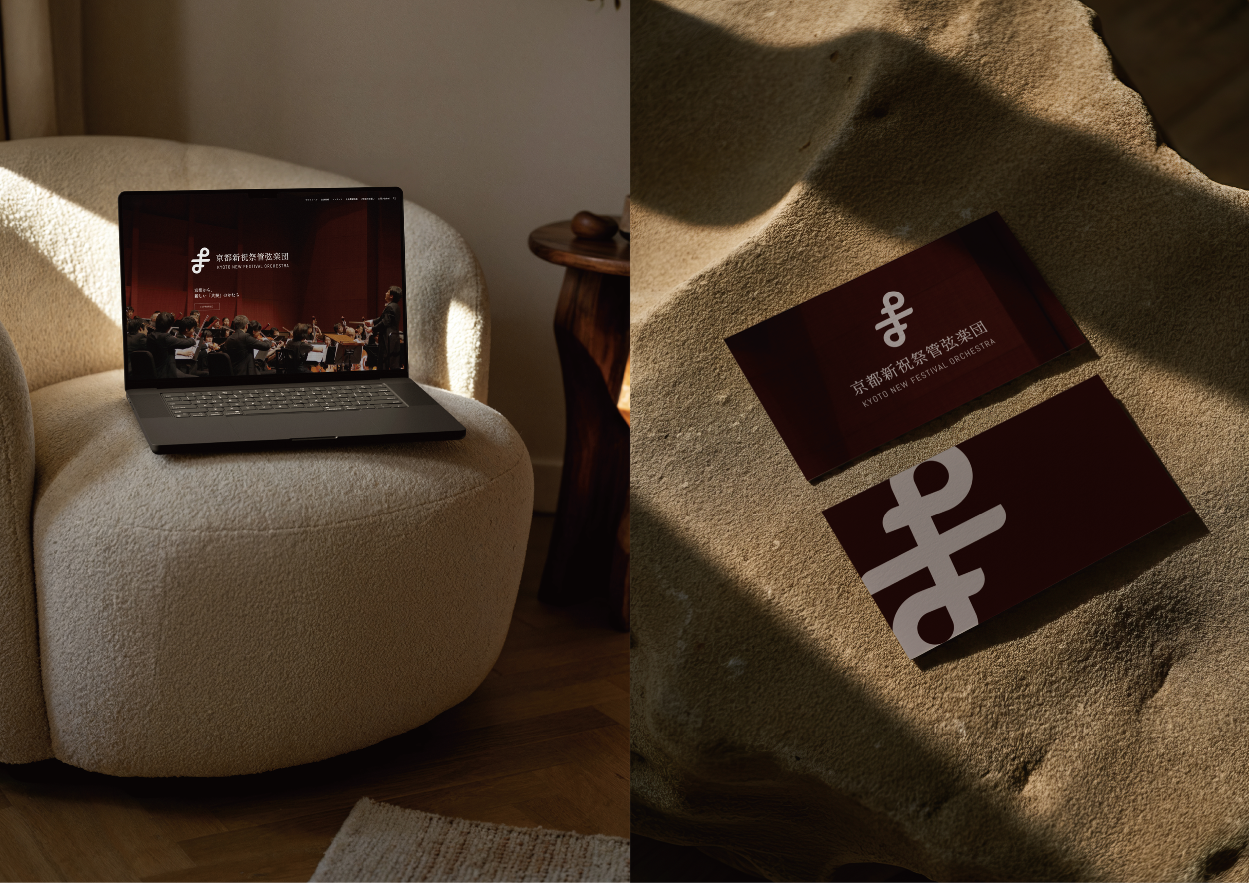
The logo brings together two musical notes that intertwine into an infinity symbol, expressing the timeless and unifying nature of music. Within the form, the letter F appears subtly as a reference to both Festival and Forte, connecting celebration with musical intensity. Inspired by the interwoven structure of Kyoto’s traditional kumihimo braids, the symbol also reflects the orchestra’s spirit of bringing different voices together in one expressive whole.
-
The wider visual direction extends that same sense of flow and interconnection. The identity was developed to feel alive rather than rigid, allowing rhythm and movement to remain at the center. By balancing structure with a more organic sense of motion, the design echoes the orchestra itself: precise and full of energy.