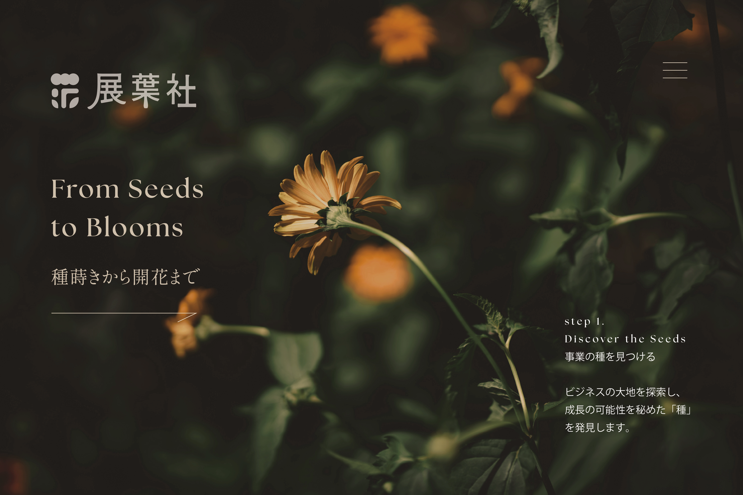
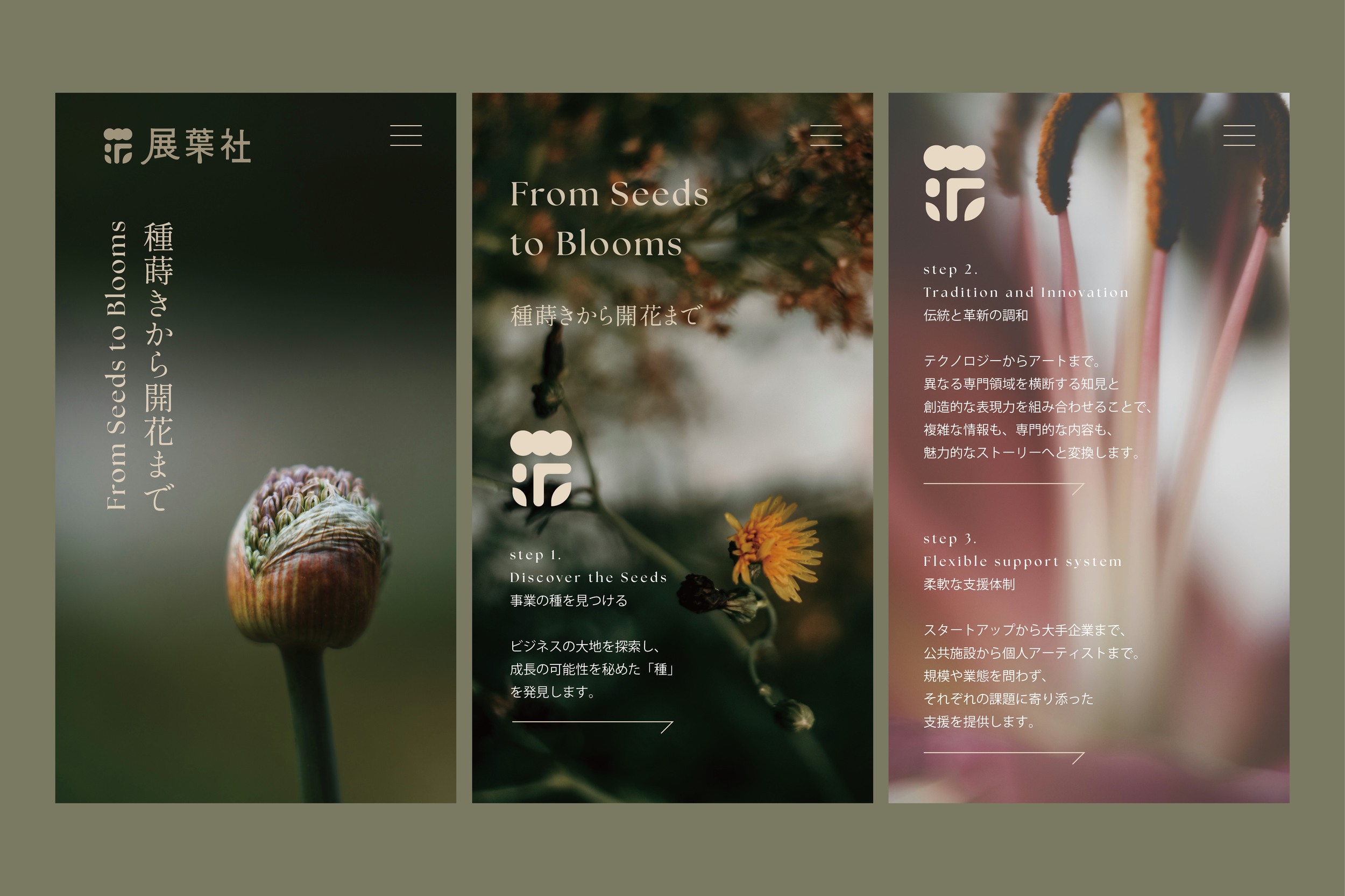
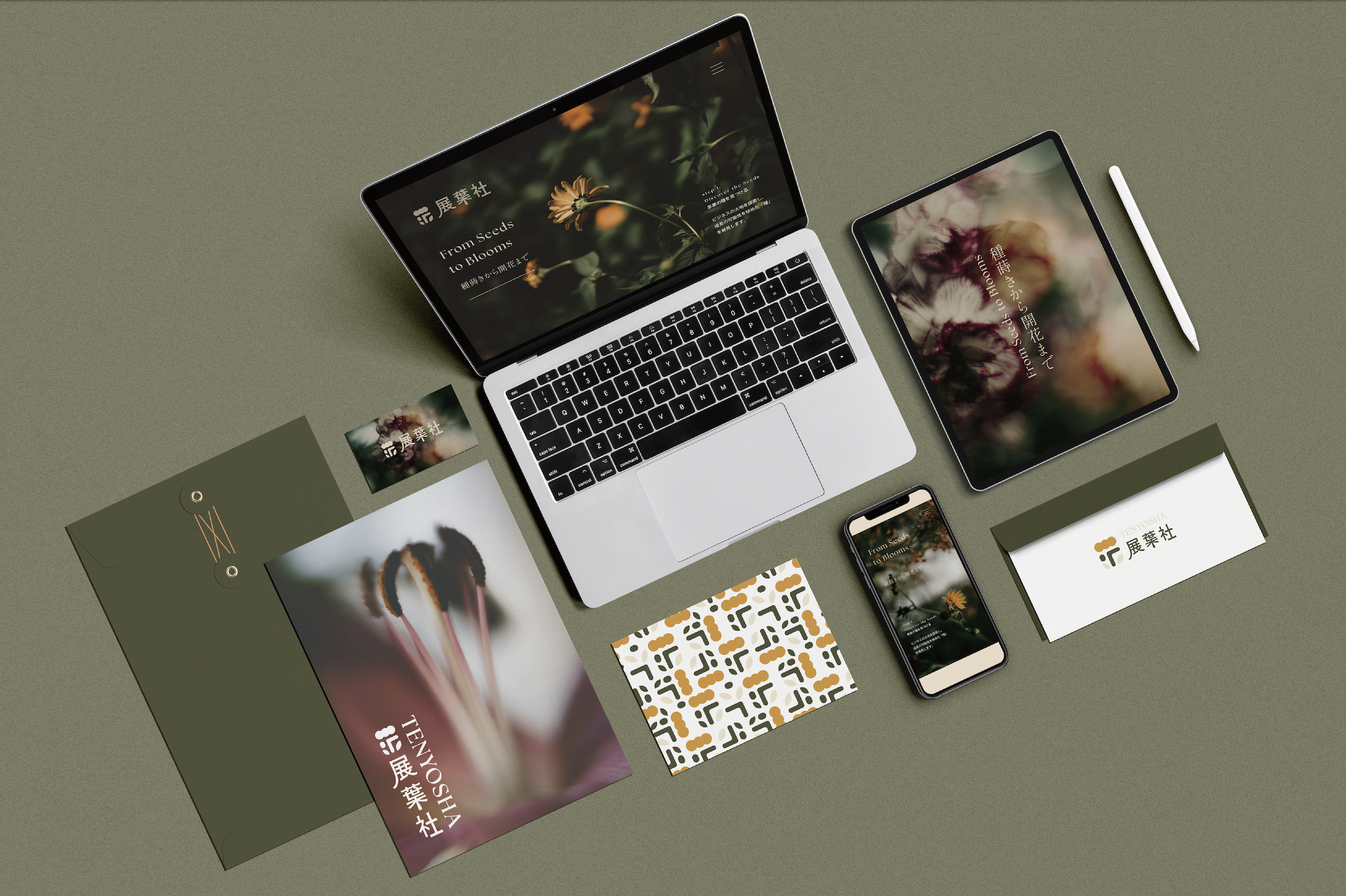
Tenyosha is a Kyoto-based creative company guided by the idea of turning creative seeds into future possibilities. Developed in response to the catchcopy From seed to bloom, the visual identity was designed to feel expressive and alive rather than overly corporate, reflecting a company rooted in creativity, growth, and new connections.
SERVICES
Branding, paper items
-
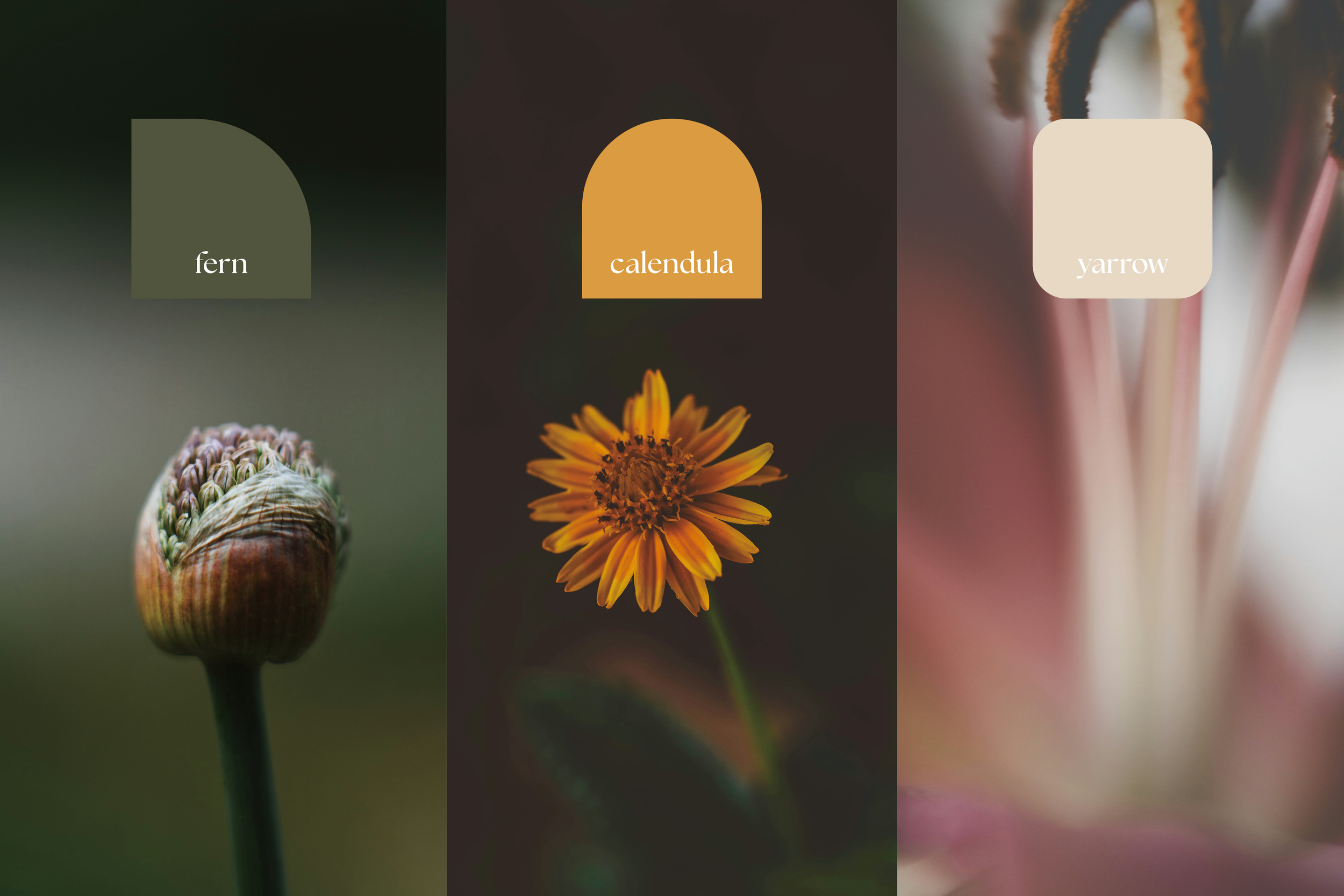
The identity takes shape around the idea of blooming as a process rather than a static image. Growth, transformation, and unfolding potential became the foundation of the system, creating a visual language that feels both thoughtful and open. The aim was to express creativity in a way that remains clear and structured, while avoiding the rigidity often associated with more conventional corporate identities.
-
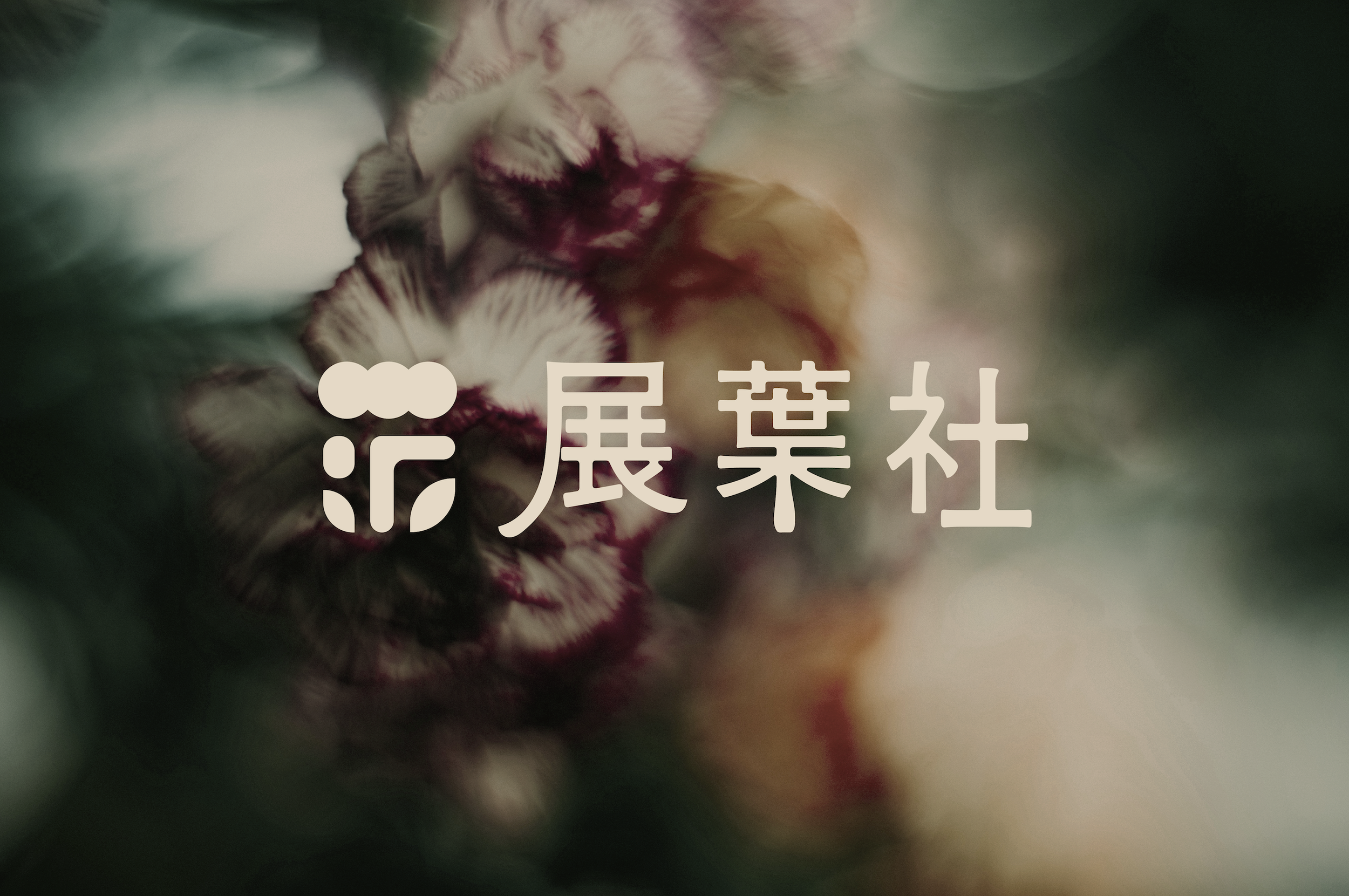
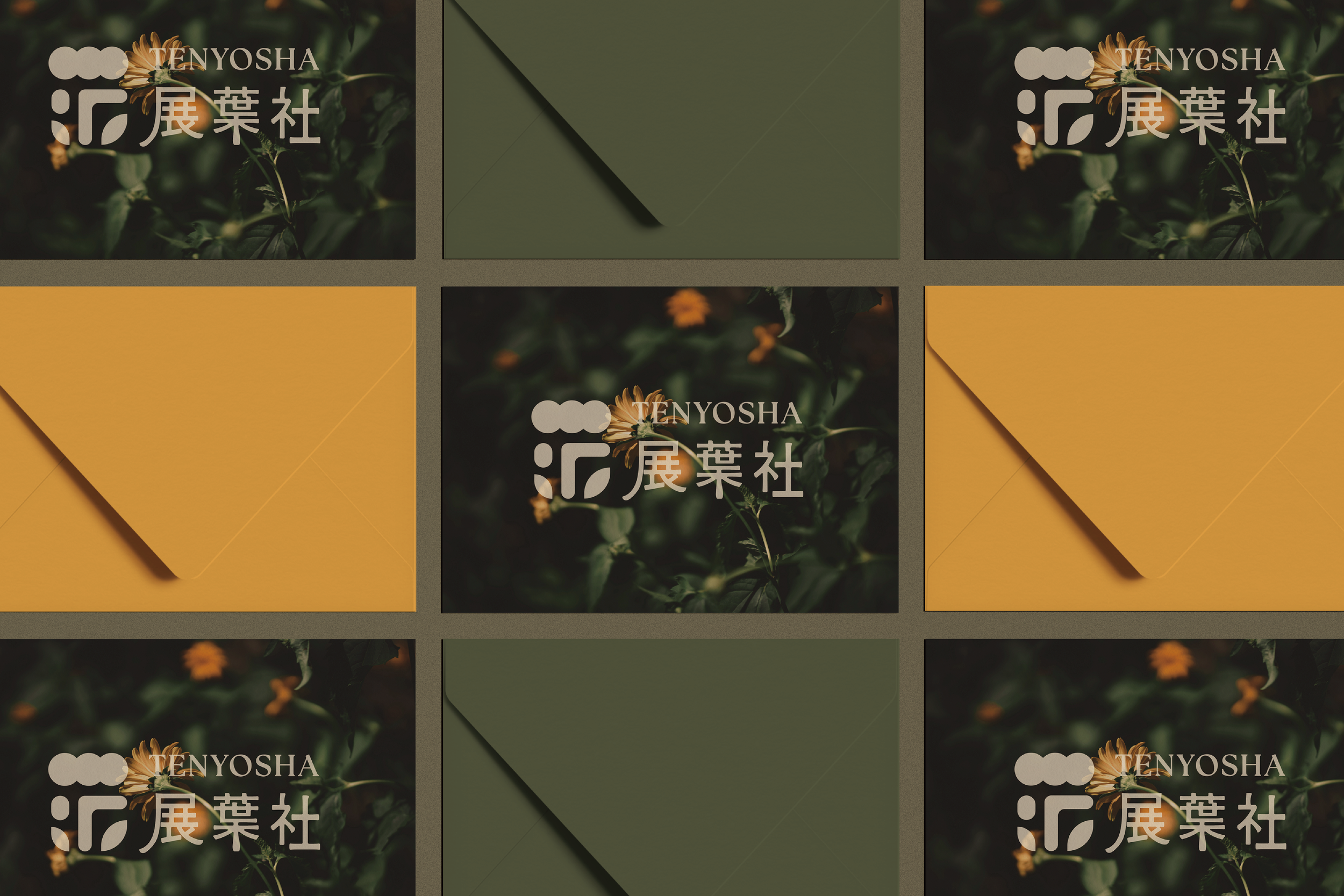
The logo evokes a flower in bloom, built from simple geometric forms arranged almost like a puzzle. When the different pieces come together, the form opens and expands, a visual reflection of ideas, people, and perspectives gathering into something complete. That balance between softness and structure mirrors Tenyosha’s own philosophy of bringing together different kinds of knowledge and creativity to create new value.
-
Across the wider identity, the same principle guided the visual direction: a system that feels precise without becoming cold, and expressive without losing clarity. The result is an identity that carries the idea of blooming throughout, with a tone that feels human, flexible, and quietly distinctive.