L is a contemporary jewelry brand by French artist Adeline Le Metté, based in Hiroshima, Japan. Conceived at the intersection of art, technique, and theory, the brand approaches jewelry as a way of giving form to ideas that are often abstract, intangible, or difficult to grasp. Each collection becomes a translation of concept into object, balancing refinement with a more speculative and poetic way of thinking.
SERVICES
Branding and packaging design in collaboration with Adeline Le Metté, paper items, art direction
-
At the core of L is the idea of la page blanche, an empty space where anything can take shape. The brand was imagined as an interstice in space and time, a place of possibility where concepts, mythologies, and knowledge could be made tangible through jewelry. Much like a gallery, L evolves through what feels meaningful to bring forward, creating objects that illuminate ideas as much as they adorn the body.
-
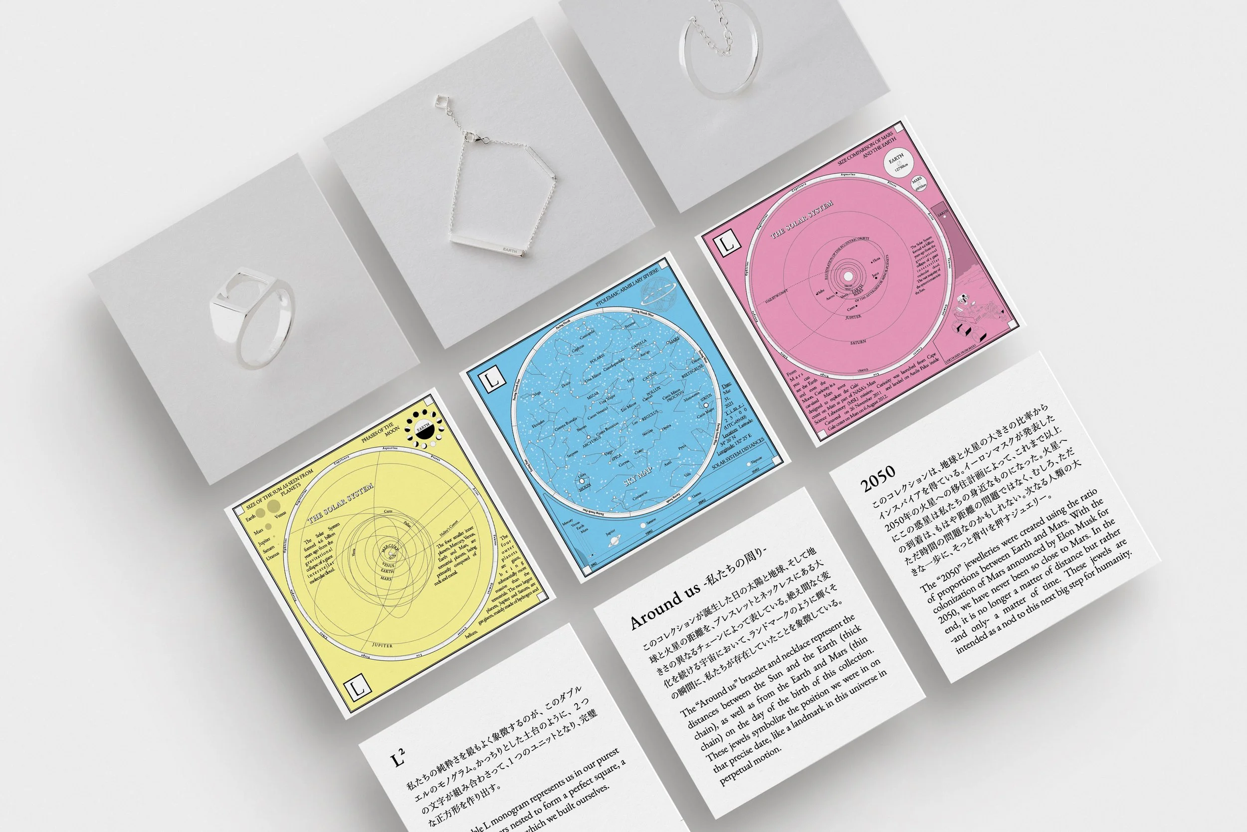
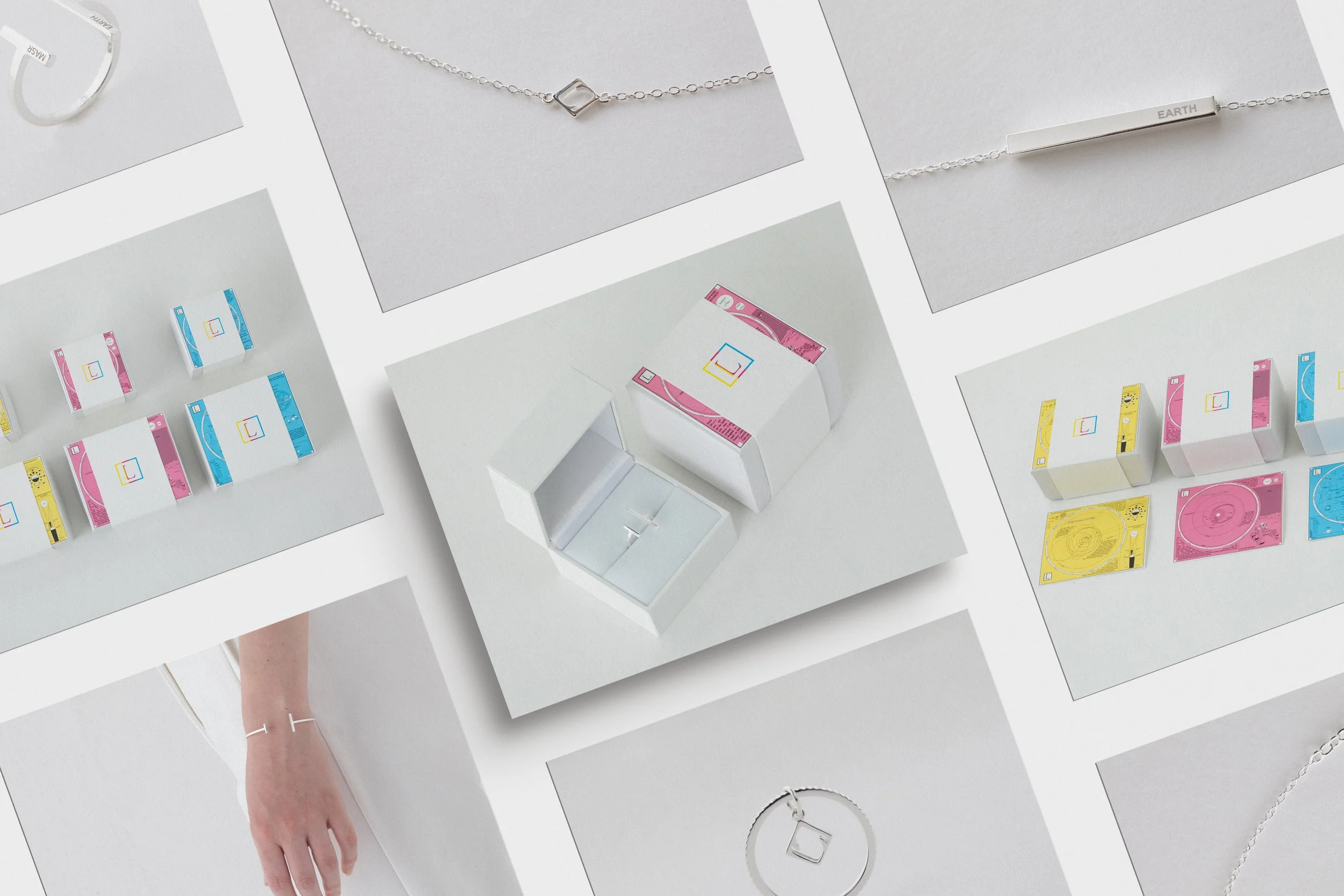
The three primary colors were used as a central part of the identity system. As the basis from which all other colors can emerge, they represent origin and possibility. Each color was then assigned to a different jewelry collection, allowing the visual language to remain consistent while giving every series its own coded presence. The packaging was designed with a restrained white base, paired with a sleeve carrying the monogram. Inserted between the sleeve and the box, a concept card introduces the philosophy behind each jewelry series, turning the act of opening into an extension of the brand narrative rather than a purely functional gesture. On the reverse side of each concept card, illustrations were developed as visual counterparts to the collections. Inspired by scientific diagrams, celestial maps, and solar-system imagery, they reinforce the conceptual nature of the brand while giving each piece a wider sense of context. These graphic elements help position the jewelry not only as an object of craftsmanship, but also as part of a larger universe of ideas.
-
Each collection translates a different conceptual framework into form.
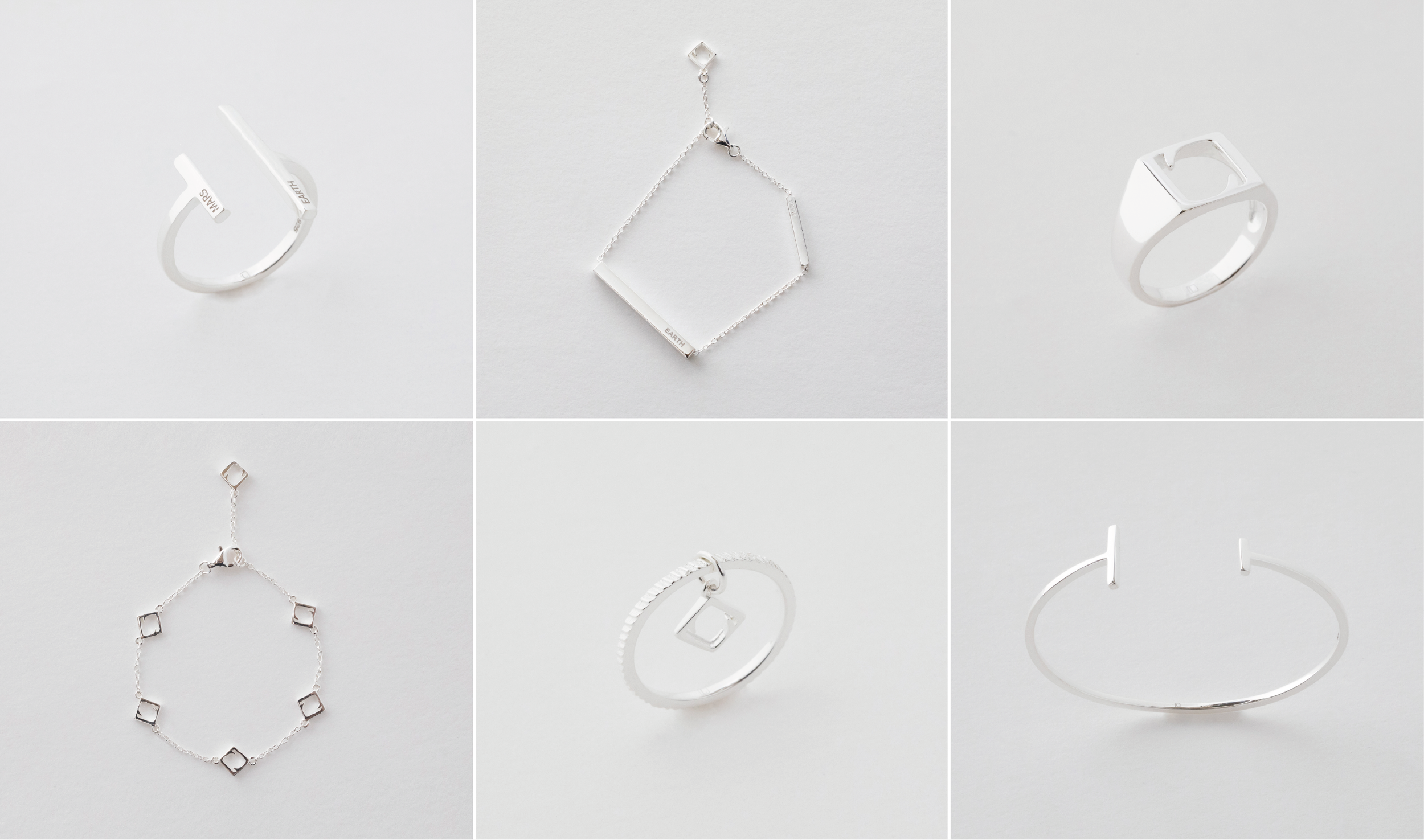
L² represents the brand in its most essential state, using the double-L monogram as a symbol of unity, balance, and structure.
2050 draws from the proportional relationship between Earth and Mars, turning a distant planetary reference into a meditation on time, nearness, and future possibility.
Around Us reflects the distances between the Sun, Earth, and Mars on the day the collection was born, transforming a precise celestial arrangement into a wearable marker of presence within a universe in constant motion.